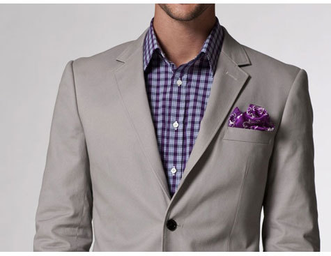
There seems to have been some confusion about this post, in which our pal GW criticized some catalog photos for Indochino, and we agreed, wholeheartedly. GW looked at the photo (the undecorated version of which is in the above slideshow) and complained about a variety of fit problems: lapels that were too small, a “lifeless” shirt, collar gaps and shoulder divots. I agreed with all, and I’d add a poor fit at the waist to the list. Overall, the photo’s a perplexing sales pitch for a brand built on custom fit.
So, let’s address these issues. First of all: what is a collar gap?
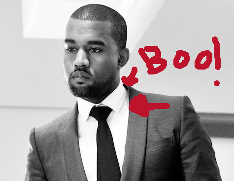
A “collar gap” is a gap between your jacket’s lapels and your shirt’s collar. It’s bad. You want the line of your coat’s neck to follow the line of your shirt collar around your neck. When it doesn’t, you get a gap. A gap is particularly bad in the back of the neck. where the collar of the jacket should be in contact with your shirt collar, and naturally sit about half an inch below the top of the collar.
In the photos above, you can see a photograph of Kanye West, usually a well-dressed guy, in a jacket with a huge collar gap. Notice how the jacket doesn’t follow the collar of the shirt? Instead, it’s pulled up and away. Part of this is his position (a well-cut jacket lapel will stay put as you move). Part of it is that this jacket just doesn’t fit him – probably in the upper back and across the chest.
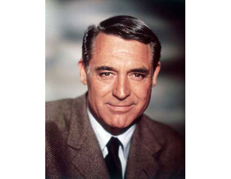
In the photo of Cary Grant, you can see how a jacket should relate to a shirt. Even with what looks like it may be a button-down collar, the jacket follows the lines of the shirt. It fits snugly around the neck, hugging the curve around the neck and down into the chest. There’s also a bit of shirt visible at the back of the neck. The shirt collar and jacket lapel are in contact all the way around his neck.
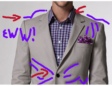
Now, let’s turn our attention to the Indochino promotional picture the GW was annoyed by. I’ve provided both an untouched version of the picture (taken from Indochino’s website), and one with my own elegant retouching added. (I used a tool called “pencil” in a high-powered prosumer software called “Adobe Photoshop Elements 2.0”).
In the Indochino photo, you can see the jacket pulling out and away from the shirt collar. Only the fact that the collar is open and spreading hides this. I’ve pointed out an area where you can see this separation nonetheless.
There’s also trouble with shoulder divots, both across the top and front. See how the shoulders look like craggy mountains? That’s because they don’t fit. They appear to extend well beyond his shoulder line, and that plus a lousy fit in the chest and possibly the upper back have made the whole area look like an Excitebike course. I’ve added lines to show the awkward contour across the top and the weird dimpling in the front.
The shoulder line should be straight (or at least not bumpy), and the shoulder shouldn’t extend too much past the wearer’s actual shoulder. Most importantly, the shoulder and upper chest should look smooth and placid. A jacket that fits in the shoulders will smooth out and improve the appearance of the lumpiness and bumpiness up there. This one seems to add new lumps and bumps.
In addition, you can see that there are lines radiating out from the waist button. The dimples go almost all the way to the side seam. This is a sign of an ill-fitting jacket. A well-shaped and balanced jacket will have little stress at that point. A tiny bit of pulling is OK… this fella has what amounts to an X-Men symbol on his midsection.
And yeah, the less said about that fountain of pocket square, the better.
(One note: some people use the phrase “collar gap” to describe the space between the blades of a shirt collar – the place where the tie knot goes. That’s not what we’re talking about here.)


