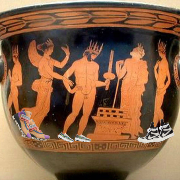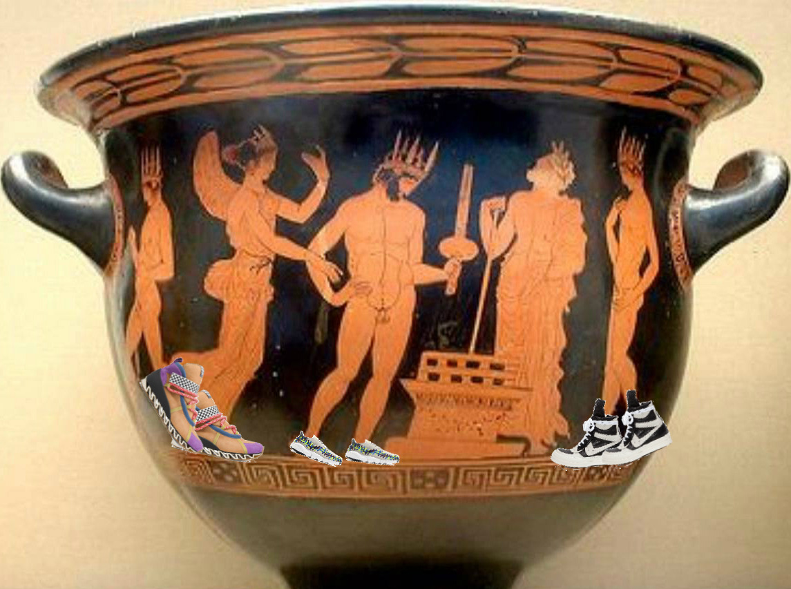
“Beauty is truth, truth beauty,” wrote a young John Keats, inspired, ostensibly, by an ancient Grecian urn, a masterpiece of classical design and artistry. Bear with me: There may be good looks in clean, minimal luxury sneakers, but there’s truth, and maybe true beauty, in oddball designs, proportions that don’t follow anatomical logic, and clashing colors.
Your Stan Smiths, Common Projects, and Margiela trainers may be exceedingly wearable and totally practical. Inoffensive, and quietly suggestive of taste and refinement. But before we were up to our perfect basic white tshirts in premium takes on timeless sneaker designs, sneakerdom was the place for footwear experimentation, for flash, and for absurd application of questionable technology. And really, it still is—cutting edge performance oriented sneakers are usually the ones that age poorly, designwise, until they hit that sweet spot of nostalgia 15 years out or so. That’s why sneakers considered too weird for anyone but collectors a few years ago now get limited retro treatments and sell out. Whether poets will use them as metaphors for art in a couple thousand years? Remains to be seen.
Listed below are a few of my favorite “weird” sneakers designs. But beauty, truth, and weirdness are subjective, so let us know your own favorites.
Airwalk Prototype
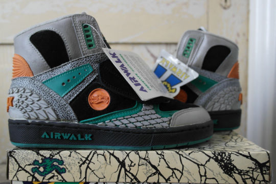
During an era when skateboarders were largely wearing simple deck sneakrs or just buying basketball kicks from the sale bin, Airwalk designed a flashy, multi-textured sneaker with extra padding and rubber in the spots where a skater might do the most damage to his kicks. Damn, they’re ugly. But Jason Lee liked em.
Mizuno Infinity Mocc
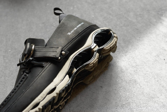
Stretching the definition of sneaker a little bit here but I’ve always liked these unapologetically ugly sneaker moccasin hybrids (let’s face it, at least in part because it’s nearly impossible to get a pair in North America).
Nike Air Mowabb
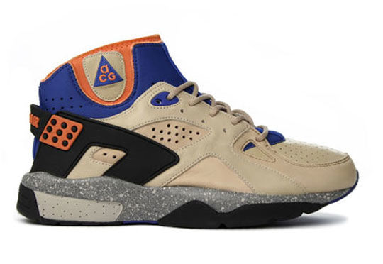
Recent reissues by Nike’s nostalgia factory have made these seem maybe a little less weird, but at the time the sockliner, heel cage, and “dirty” colors were really odd. They presaged the trail runner movement when everyone’s shoes looked dirty right out of the box.
Bernhard Willhelm x Camper Trainers
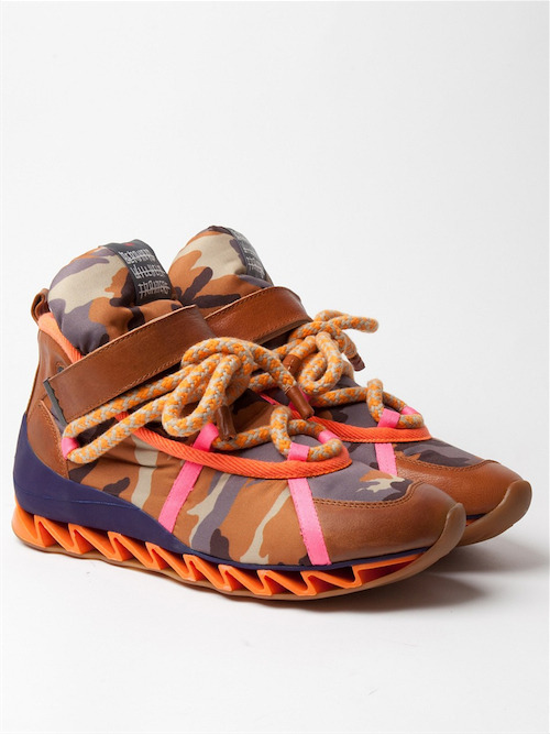
Willhelm’s sneakers remind me of Homer’s car. A slapdash design drawing brought to life more literally than seems possible. In plain colors, they’re actually pretty wearable, but then what’s the point. Bonus: there’s a NSFW colorway that actually looks inspired by Grecian urns.
Rick Owens Dunks
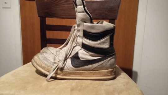
Somehow, these exaggerated basketball sneakers that look like they were designed based on the misinformed rumor of a Nike dunk have, in the course of 10 years, become borderline unweird.
Nike Air Footscape Woven
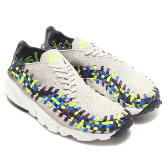
Aymmetrical design, exposed structure, and offbeat colors? These postmodern kicks are like the Centre Pompidou of sneakers.
L.A. Gear Catapult

Karl Malone’s signature shoe from 1991 implied a literal spring in the heel would help you jump higher. This was maybe the pinnacle of technology that just didn’t make a lot of sense, unless you were an 11 year old boy, in which case you really really wanted a pair.
Converse x Number (n)ine Odessa
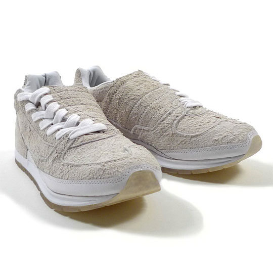
The marriage of asymmetry and hairy deerskin suede make these weirdos strangely appealing to me.
I haven’t even gotten to the weirdness of some Air Jordan designs (especially when they initially release), Puma’s various designer collaborations, Adidas’s original Kobes, and so many more. To paraphrase Keats, an ugly sneaker is a joy forever.
